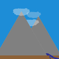
 This is the evolution of my logo.
It had humble beginnings, as I explored around the web and tried to discover what I wanted my logo to be. It wasn't until i actually made a list that things started to click.
D BEGINNING
I actually had (barely) a journal to put down my ideas for logo designs.
It's not much at all, but it's also accurate. I spent several days browsing logo designs and finally wrote a list down, and then went through the possibilities for each one. I couldn't figure out how i would make a symbol for myself, so i went with everything that was much easier.
It began with my vision of a horizontal door that is common in sci-fi stuff, which of course ended up not looking too good, and went through the list trying each idea, occasionally branching off, until of course I came upon the bob ross idea.
It was at the encouragement from all my classmates that I started the bob ross idea and sprinted with it, going from a simple idea, to a complicated masterpiece, and then finally to a legitimate logo. I knew from the getgo that I wanted to have overlapping mountains, for depth and because it makes the shape of M and is cool. I wanted a stream going through both mountains but found it was incredibly difficult to actually put my vision onto paper (which honestly is how most things go), and used clouds to emphasize the depth and create some background shapes.
Things just went from point A to B to C as ideas spiralled out, some other ideas became obsolete and others never made it onto the computer, and at the end of it all we have the finished product.


No comments:
Post a Comment