Pages

Tuesday, December 20, 2016

One of Them Portfolio Thingamajigs

For nearly the entirety of the last month, the Juniors have been working on misc projects whilst the Seniors worked on a single, big project: A portfolio. The goal was a professional but unique resume-style website that portrays our skills for potential future jobs.

We started by making a new logo; last year I watched a lot of Bob Ross, and so focused my logo theme around that, but since his stream on Twitch.tv is blocked at school, I made one around my hat that I've worn for, oh, ever and a half.

After much deliberation and comments, this is the one I decided on.
We then spent several weeks working on the website; I didn't take any pictures, unfortunately, so I can't effectively illustrate how that process went. 

I spent a lot of time on making it responsive, and really in the end if I had planned better it would have been infinitely faster. But I like how it looks and it flows seamlessly, and if I ended up doing this again I'd probably make it similar.

While there are a few things missing that were suggested, I'm happy with the end result.


You can check it out here.


Monday, September 19, 2016

To Create Another Logo

So, continuing on from my previous two posts, I knew how to immitate properly and I knew what my limitations were.

This was the first rendition- I had a little help for the poker chips, but all of the colors and the patterns were of my own making.

I also expiremented with different fonts and casino chips; when I asked my classmates, resoundingly the middle one was the best. At the specific complaint/request of Caitlyn, I messed with the spacing.

This is the one I ended up sticking with, although I made several SEVERAL different flavors


However, I felt like none of these would look very good small, so I decided to also make one for things like the Favicon, Stamps, Hats, etc
I started in the top left and worked my way through different ideas, and in the end I didnt particularly like any of them.

So I found a really neat panda logo, and modified it for my own use. I asked nearly my entire class for their opinion, and they were split 50/50 on the dot about the left two. I decided on the bottom left.

After finalizing the design, we had to create real world objects with our logos.


Monday, September 12, 2016

To Learn to Steal a Logo

Today in web we read "How to Steal Like an Artist", a tongue in cheek book by Austin Kleon, about creativity and how originality isnt 100% original. Specifically, we read the first chapter, which centered around taking work and changing it for your own needs or to make it more personal. He says that people should take paper with them everywhere they go to jot down logos or idea or pieces of overheard conversation for later ideas, with lots of quotes from several artists relating to improving on other's work. He seems to rely a lot on testimony, but given that he is a professional it's not really a downside.

The points he makes are good ones, and he supports them well. I can see myself using this and helping other people use this, and in the future in general.

http://austinkleon.com/steal/

Friday, September 2, 2016

Project Proposal

Today in class, we were handed sheets for what seemed like random stuff at first; a mineral, an animal, 2 letters, and a number between 1 and 1000. I got Opal, Panda, Z, M, and 500.

I came up with a few ideas, and I felt like each one would be plausible for a full fledged website, and I had an idea for the design for each. Funny enough, both my teacher and a couple classmates couldnt decide...

In the end, I decided upon the "Opal Panda 500 Casino". This fictional casino will be located in California, and will be focused on an oriental origin and jewelry of some sort. Because of my own ideals, and for the sake of the school, I want to orient it towards families, with some sort of half-casino-half-somethingelse. Or maybe I'll just gear it towards young adults, with a soft tone. I dont even know yet!

Thursday, September 1, 2016

New Widget & Project

I have put a link to my website on the sidebar, and plan on updating it with recent projects.
Unfortunately, we need comments for a project!
So I shall also post this, announcing the inclusion, and linking my newest project here too!
Yay!

Tuesday, August 23, 2016

Adobe CC Tutorial

Hello again! It's been a long time. How have you been?

Web Design as a Senior has kicked off great, with all the same crazy people joining me as web seniors, the guiding hand for the poor juniors who have to put up with us. After the first day we started off with new things for everyone, including the recent upgrade to Adobe CC, which gives us a vast assortment of new features.
One of which, and by far my favorite, is the ability to extract CSS from Adobe Illustrator.

This may be a blast from the past for a few of you; this is a project from Sophomore year, wherein we made a design in illustrator and recreated it in dreamweaver. This new feature literally outdates the long and tedious process, much to my (and im sure many other's) adorment.
The process starts with the CSS Properties window, seen above.


Select all of the elements...
Export All...


And done! Connect that to a basic HTML file, and you've just saved hours of work and adjustment in CSS.

Thursday, May 12, 2016

Extreme Web Makeover

Hey, guys!
Been a while, huh?

Today we have been given our final project; redesign a high school's website and base it on a professional company's website.

I am redesigning Indian Creek Elementary's website


...based on Games Workshop's website.


This will likely be incredibly challenging; but it is, after all, the final! It wouldn't be right if it were easy!

Monday, January 25, 2016

Logo

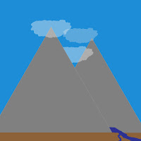
This is the evolution of my logo.
It had humble beginnings, as I explored around the web and tried to discover what I wanted my logo to be. It wasn't until i actually made a list that things started to click.


D BEGINNING

I actually had (barely) a journal to put down my ideas for logo designs.


It's not much at all, but it's also accurate. I spent several days browsing logo designs and finally wrote a list down, and then went through the possibilities for each one. I couldn't figure out how i would make a symbol for myself, so i went with everything that was much easier. 

It began with my vision of a horizontal door that is common in sci-fi stuff, which of course ended up not looking too good, and went through the list trying each idea, occasionally branching off, until of course I came upon the bob ross idea.


It was at the encouragement from all my classmates that I started the bob ross idea and sprinted with it, going from a simple idea, to a complicated masterpiece, and then finally to a legitimate logo. I knew from the getgo that I wanted to have overlapping mountains, for depth and because it makes the shape of M and is cool. I wanted a stream going through both mountains but found it was incredibly difficult to actually put my vision onto paper (which honestly is how most things go), and used clouds to emphasize the depth and create some background shapes. 


Things just went from point A to B to C as ideas spiralled out, some other ideas became obsolete and others never made it onto the computer, and at the end of it all we have the finished product.


Friday, January 22, 2016

Design Features in Professional Websites

Kool Website Designs

http://www.calm.com/


This site is probably the most interesting one I've found. It's by far the most minimalistic functional website I have seen, with at the most 5 different things taking up screen space. The obvious one is the background video, the 2 buttons in the bottom right for volume and video selection, and the logo, with a button for the menu which advertises their app & offers different amounts of meditation, and links to various affiliated pages.

I first took interest in the menu, and found that it was a simple animation done with CSS3.


After that I found where the videos were hiding, which are shown through HTML5's video tags and some javascript to fade it in and out.


 Finally, I found the code for the actual video controls. The code for which is incredibly long, so I grabbed a screen cap of the different names for the events instead.


http://thestatusaudio.com


This one was a little more generic for a professional design, featuring a lot of big pictures and some text. A lot of their design was hard to read if only because they made it overly complicated, but most of it used CSS3 animations. I went ahead and grabbed a simple example of this, with a hover button.


Next was an image rollover. I couldn't find the javascript used for this but I'm sure it's buried somewhere in the source code.


http://www.nicholasmoegly.com/


I wasn't able to find anything else unique about the last site, so I grabbed one last website that had something I actually hadn't seen before, although the only reason I was able to is because of the school filters.

This site has a neat loader spin thing, which used what looks like a combo of CSS3 and javascript for a placeholder loading image for social media links.