- For the final of animation, we have made a pen. We were asked to take out a writing utensil, preferably a pen, and we were to create it in Maya. And then we were let loose. I am incredibly happy with how my pen came out, and I think it looks super good. I want the lighting to be cooler, but oh well. One of the major things I actually learned from this was that the saying "think outside the box" is almost the definition of maya. I started to make my pen cap when my teacher came over and showed me a completely easier and better way, that I had never thought of. If I have to do this again I will spend a lot more time actually on the lighting and maybe the color, although a all-black pen can't really have a lot of variation with it's color. The way it's modeled I think looks absolutely amazing and I hope I can replicate it in the future.
Tuesday, December 16, 2014
Pen Final, Animation
Tuesday, November 25, 2014
Polything, Animation
We don't actually need to post this on the blog, but I thought it looked kinda cool so i did anyway. We were once again given a PDF and shown how to make the thing. It was kinda easy- we needed to use cylinders and used them to cut shapes into a sphere. I guess next time I would change the color, because I'm not a big fan of bright yellow. Maybe something blueish. I like the lighting a lot though, so I would keep it.
Monday, November 24, 2014
Hammer, Animation
We have been hard at work in a new program called Maya, which I used to create the donut in my last post, and have finally created something I think looks pretty good. The scope of our project was to learn how to model. We were shown each step of the hammer, and given a PDF to follow. I started with a small rectangle and dragged it up, and then extruded it to make the hammer head. Then I messed something up and restarted, this time with the extrude in front for the front of the hammer and the back. Then once again I had to restart, starting with just making the back of the hammer head. I used soft edit to curve the claw back, and extruded the front of the hammer 3 times to give it the in-and-out shape. After the hammer was done, I tried beveling the edges to make it roundish, but technical errors wouldn't let me. I rotated the hammer own os it was laying on its side and made a large plane for the hammer. I tried finding a desk texture, but they were all either wooden or had 3d objects such as phones or keyboards. So I jet went with a generic wooden texture. I then setup a spotlight above and to the left of the hammer to give it a little shadow and made a really soft area light. Since i wanted a lot of shadow, I took another spotlight and set it up to shine on the front of the hammer and give it a sort of cinematic light. After all of this I beveled the edges one by one and got at least the front beveled. So while it looks roundish, the back is untouched. I think next time I'd try not to make constant mistakes like I did in the beginning, and make the front of the hammer a little more roundish, but I am super happy with how the claw came out, and the lighting. For my next project I'll try and get things right the first time and figure out how the bevel tool works.
Friday, October 31, 2014
Monday, October 6, 2014
Bio/Project 8, Web Design
This is what we've worked on for about the past month. We've done a lot of learning for this, and I am actually very proud of what I've made. We learned first about CARP, the 4 rules of all graphics. Contrast, Alignment, Repition, and Proximity. With this you can easily make a really good graphic. We learned about the "<div>" tag, which is used to separate different parts of your website. In order to make the styles uniform, we learned about CSS files, which tell a website how it should look, and how to make one. There are actually 3 types of incorporating CSS into a website; built into a div, built into the top of the website, or a separate file. We've mostly used the top, but this time we used a separate file.
For the picture, we all went out to the hallway to get our pictures taken. We then color corrected and cut out the photo. This is the picture I used.


We also used a background tiling image, where we took a picture of concrete and used various tools to make it seamless. We also used some color correction tools to blur it out as to not take attention away from the actual content of the page. This is the picture I made.
I didn't really run into any issues, other then missing a few class periods due to band. I also had some technical problems which I needed help with. Next time I will make the CSS file use better colors, because I don't think that the font colors I picked are very pretty or appealing.
Thursday, October 2, 2014
Multi-Plane, Animation
When starting we learned about how Walt Disney invented the first multilane camera, which gave different layers a more realistic feel because they moved at different paces, just like real life objects do. I ran into an issue with actually animating it, because of how I made the island symmetrical and normally its not. But I think I made it work.
Monday, September 22, 2014
Character, Animation
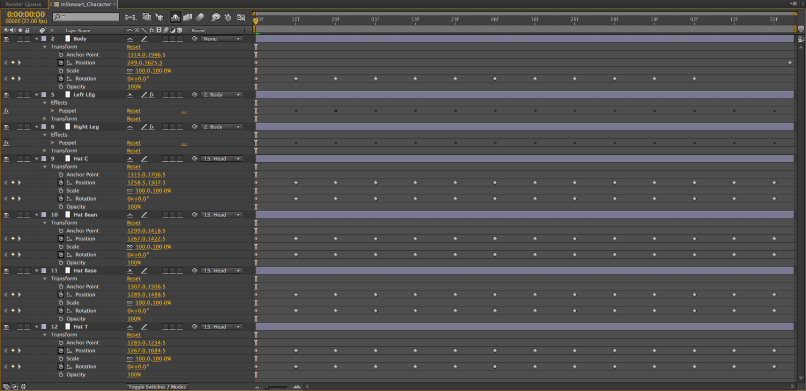
My character is a british gentleman of leisure. I decided to design him like so because I figured that making a serious person look ridiculous and act ridiculous would be funny. I took inspiration for the hats from the video game Team Fortress 2, wherein they state "A man's wealth is measured by the amount of hats he wears on his head." and so, I put 4 hats on him that wobble back and forth.
 I originally had him holding a teacup and a cane that would bounce back and forth as he walked, but I ran into complications with the teacup and the cane wouldn't have worked like i would have liked. I also do not like the colors I used, but I couldn't find any suitable so I rolled with it. The hats was the hardest part but only by a little bit, because the copy/pasting wasn't working like it should. Everything else was easy in comparison. .
 I learned that making your character's feet point the same way is important if you're going to make the character walk like a normal person (which was actually the original plan), the puppet pin tool is useful for more then just making a thing squash and stretch, and that 100% black suits are not easy to work with.
An issue I had while making my character walk was with the aforementioned feet. I originally planned on having the character walk like a normal person and his hats would flop back and forth far more then they do now. If i could redo my animation i would add and fix up the teacup and the cane. Overall though, I think I did a good job.
In class, we had peer critique-ing over everyone's animation. The class pointed out that the size of the animation was too big, and that an easy fix for the legs pointing different directions would've been to flip the leg around. However, they thought the hats and the leg animation was hilarious.
This is a resized version.
Labels:
after effects,
animation,
big post,
pictures,
videos
Wednesday, September 3, 2014
Inchworm, Animation *FIXED/IMPROVED*
Project 4, Web Design
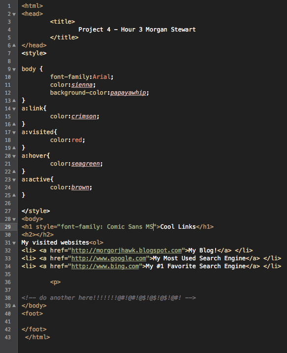
So while we can't actually upload any websites or anything like that yet, I still want to show off what I'm doing in web design because I think it looks cool. The top picture is the HTML code (hand-typed) and the bottom picture is the product thus far.
Thursday, August 28, 2014
Inchworm, Animation
P.S. My animation >>>>>>>>>>>>>>>>>>>>>>>>> Cody Wilcox's thing.
Tuesday, August 26, 2014
Color Wheel, Web Design
This is my first Web Design project. Before we actually started doing web site stuff, we made a color wheel because color use and color variation is EXTREMELY important for making your website unlike the other websites out there.
Bouncing Ball, Animation
Subscribe to:
Comments (Atom)


